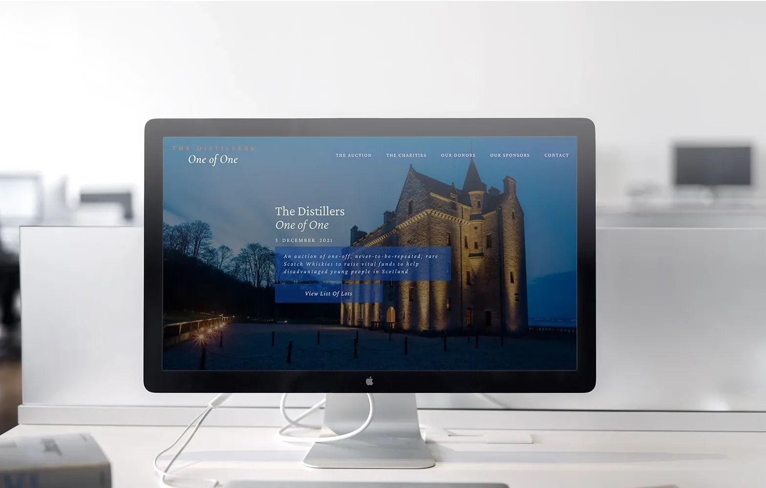
The Distillers One of One Charity Auction
Project Details
The concept, design, build and deployment of a microsite to promote a Sotheby's auction of rare and one-off whisky for charity. Over £2.5 million was raised and distributed to help disadvantaged young people in Scotland.
Project Contribution
Project Tools
The creation of a microsite to promote the auction of rare and one-off whisky for charity.
Over £2.5 million was raised and distributed to help disadvantaged young people in Scotland.
The client had just the idea that they needed a website to promote and build from. At speed we iterated on initial sketch designs and expanded the charity brand assets to include colour palettes and typography.
We then moved to a high-fidelity prototype for presentation and sign off by the stakeholders.
View Live Project
The design quickly moved from a sketch concept to show blocking and page coverage before moving to a high-fidelity version
At the end of each stage of design I maintained close with the project stakeholders to inform them of progress and to demonstrate the latest iteration of the concept. Given the time-sensitive nature of the project, insisting on weekly feedback meetings helped the project move at pace and always ensured it was moving in the right direction.
Typography
The client came to the project wishing to maintain their word mark's use of serifed type – based in some degree on Baskerville and Garamond – to convey a sense of luxury and brand recognition. After some discussion and steering it was settled that a readable sans serif type would make better sense for the body copy.
This let us explore serif type to add accent and interest to headings to add touches of style and luxury to discreet elements on the page to reinforce the brand recognition.
For the body text, the ever-reliable Open Sans was chosen. Its combination of legibility, friendliness and excellent reproduction on all device types made it a clear frontrunner. It also paired excellently with the serif type of Crimson Pro, with their shared short descenders, loop tail and eared g's and double-storey a's.
Crimson Pro, used in both regular and italic variants, adds elegance and class without making the text hard to read. By using serif type on just the headings, the main content is easily scanned whilst the reader's eye is held more by the titles. Being based on Garamond it also serves as an excellent pair to the client's word mark and anchors the headings with the word mark visually.


Colour Mapping
Coming into the project, the client had white and black versions of their word mark, in addition to the accent colour, shown here as "auction copper".
I suggested early in the process to move forward with a single colour as the main focus, and to make changes to lightness and alpha levels as necessary to create hierarchy. This was in addition to using shades of white and black in the design too.
The main colour, Auction Blue, is rich; chosen signify luxury, power and gravitas as required by the client. In addition to the main colour tone and accent shade of a lighter blue compliments to add spots of interest throughout the design whilst maintaining the clean look.
To balance the blue tone I have brought in a soft white tone that serves as the "page" colour and reversed text colour. This white has a tiny amount of blue colour to echo the main colour. To compliment the black tone is moved away from pure black, easing the strain of reading the large blocks of text.

I am happy that whilst this project was on an accelerated timeline, we were still able to deliver what the client needed, followed best practice for design and accessibility and were able to contribute a piece of the puzzle to help the charity raise £2.7M in donations.
An upgrade is planned to build on the existing version with additional experiential and motion design integrations.

Seen Something You Like?
I hope you enjoyed this frontend development project. If you feel I could be a good fit for something you are building, I'd love to chat!
I thrive as part of multi-disciplinary teams but I am equally happy to fly solo when needed and I am always happy to offer advice and guidance.
get in touch