Theatre Booking Website
Project Details
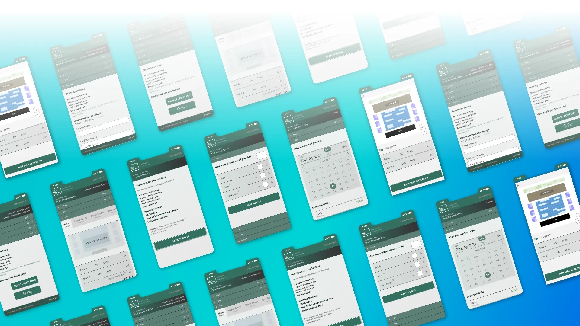
User research and design project incorporating usability testing and interactive prototyping for a client-facing ticket booking website with a focus on mobile navigation.
Project Contribution
Project Tools
This ticket booking platform used a combination of user research, stakeholder analysis, scenario planning, design iteration, prototyping and usability studies to reach the endpoint.
This frontend design is part of a larger SaaS project to provide a complete booking management system for venues. The frontend system shown in this project would itself have limited customisation from the theatre management to allow for a custom logo and colour palettes. This additional constraint would need to be kept in mind as the product was developed.
Presented below are the elements of the project focussed on user research, design iteration and usability testing through interactive prototypes.
User Research
After an initial meeting with the theatre management stakeholders it was determined that the product would need to have a logo and colour palette that was customisable to ensure brand continuity for the client purchase journey.
After a survey of competition websites an initial user research questionnaire was produced to gather feedback from a group of users. These users were chosen from a sampling of a test theatre's audience across a week of performances.
Users were questioned about existing booking solutions as well as good purchase journeys and any pain points they could remember. Additionally, they were asked to provide more general information about how and why they purchase theatre tickets.
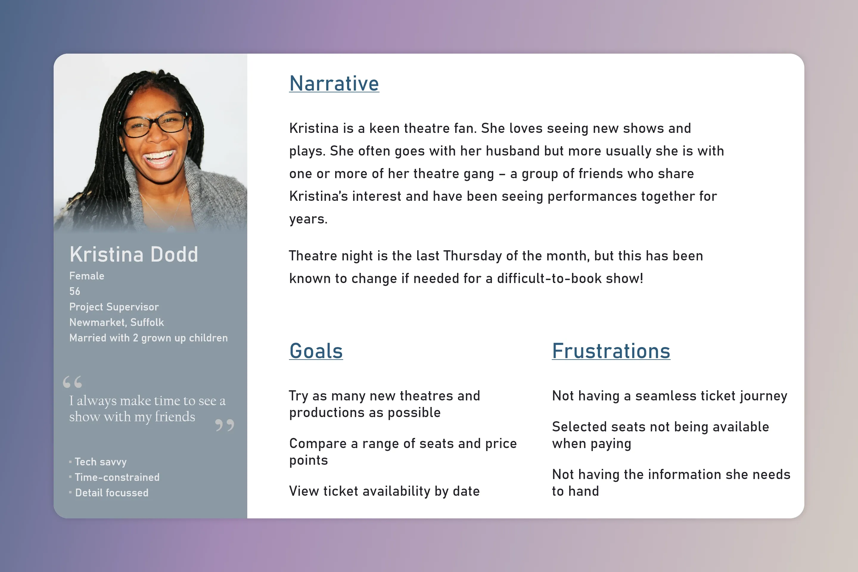
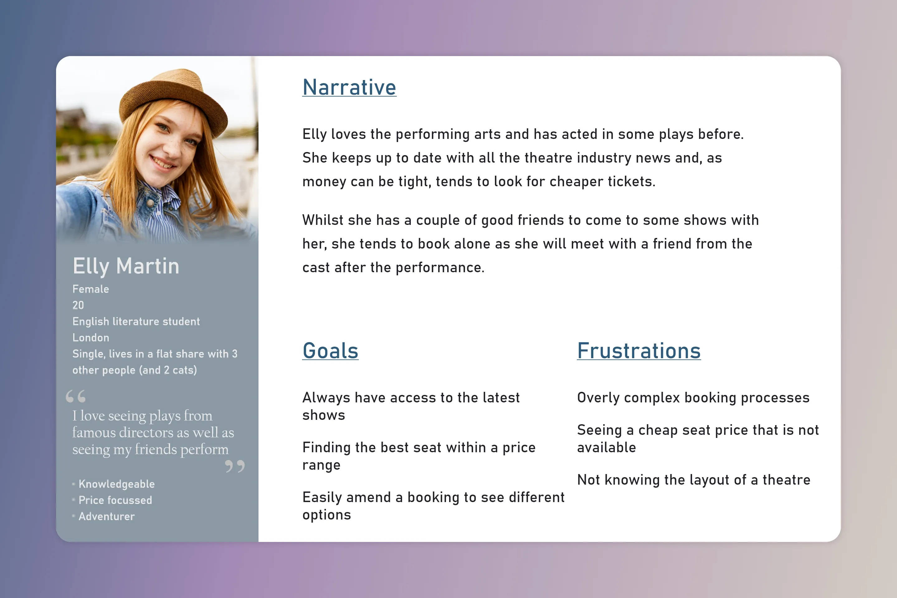
Synthesizing the results of the survey we created a set of user profiles to demonstrate the goals and motivations of a broad range of our users. Two of the created profiles are shown here. Developing and refining these profiles helped keep the user's needs in sharp focus during the phases of design iteration.
Prototyping
After initial rounds of wireframing and low fidelity mock-ups a design direction was established, and the concept moved to high fidelity mock-ups.
User testing was key to this project and in addition to the pattern recognition and layout test with users for the low fidelity prototypes, the product owners also wanted a focus group to complete a set of tasks that were core to the problem the product was designed to solve.
Participants in the test were given a set of instructions and interacted by themselves with a high fidelity prototype of the design that was constructed in Adobe XD. Results from the testing was both quantitative and qualitative, with the outcomes fed back into the next design iteration.
Interaction Design
The product team chose to use Adobe XD for this project. This meant that design files could be shared collaboratively, and prototypes shared with all stakeholders as required as well as the developers once a final version was chosen.
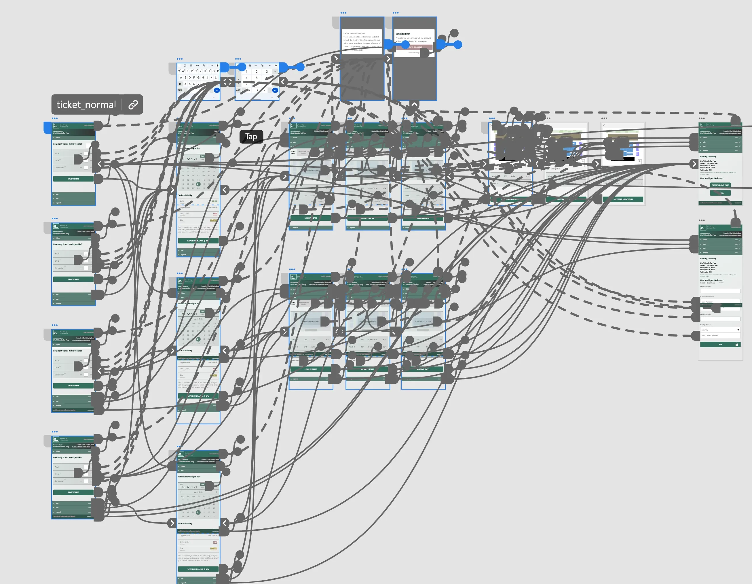
The use of Adobe XD allowed for rich interaction through the creation of components. The button components allowed for hover and toggle states for buttons. Error styles and animations were created for form fields and micro-interactions were added for call-to-action buttons.
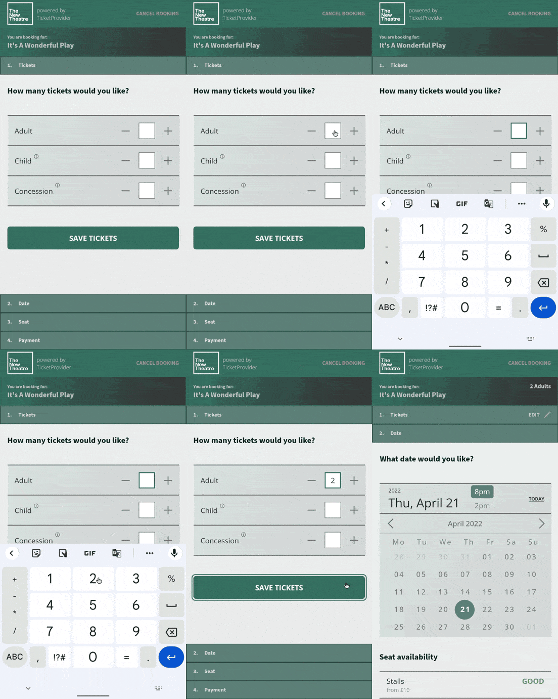
This project page shows 3 participants completing tasks set by a testing facilitator. They show choosing a number of tickets, seeing the shows on a set day and selecting one, as well as the purchase flow when entering personal information.
The fact that this project is part of a larger product made it very interesting to work on. There were considerations to how this piece would connect to the other systems and it was enjoyable to juggle the balance of the product owners – who are looking to market the system to venues – versus developing the system to best serve the end users.
Developing a design system that could work as a white label product, with logos and colours swapped as required, helped develop a different sense of design. I found that there needed to be a much stronger focus on the fundamentals of navigation.
Seen Something You Like?
I hope you enjoyed this ui design project. If you feel I could be a good fit for something you are building, I'd love to chat!
I thrive as part of multi-disciplinary teams but I am equally happy to fly solo when needed and I am always happy to offer advice and guidance.
get in touch